In this project, I record how many times and punches of sanitizer I
used in each day.These data has been formatted in a json file which
is shown below.
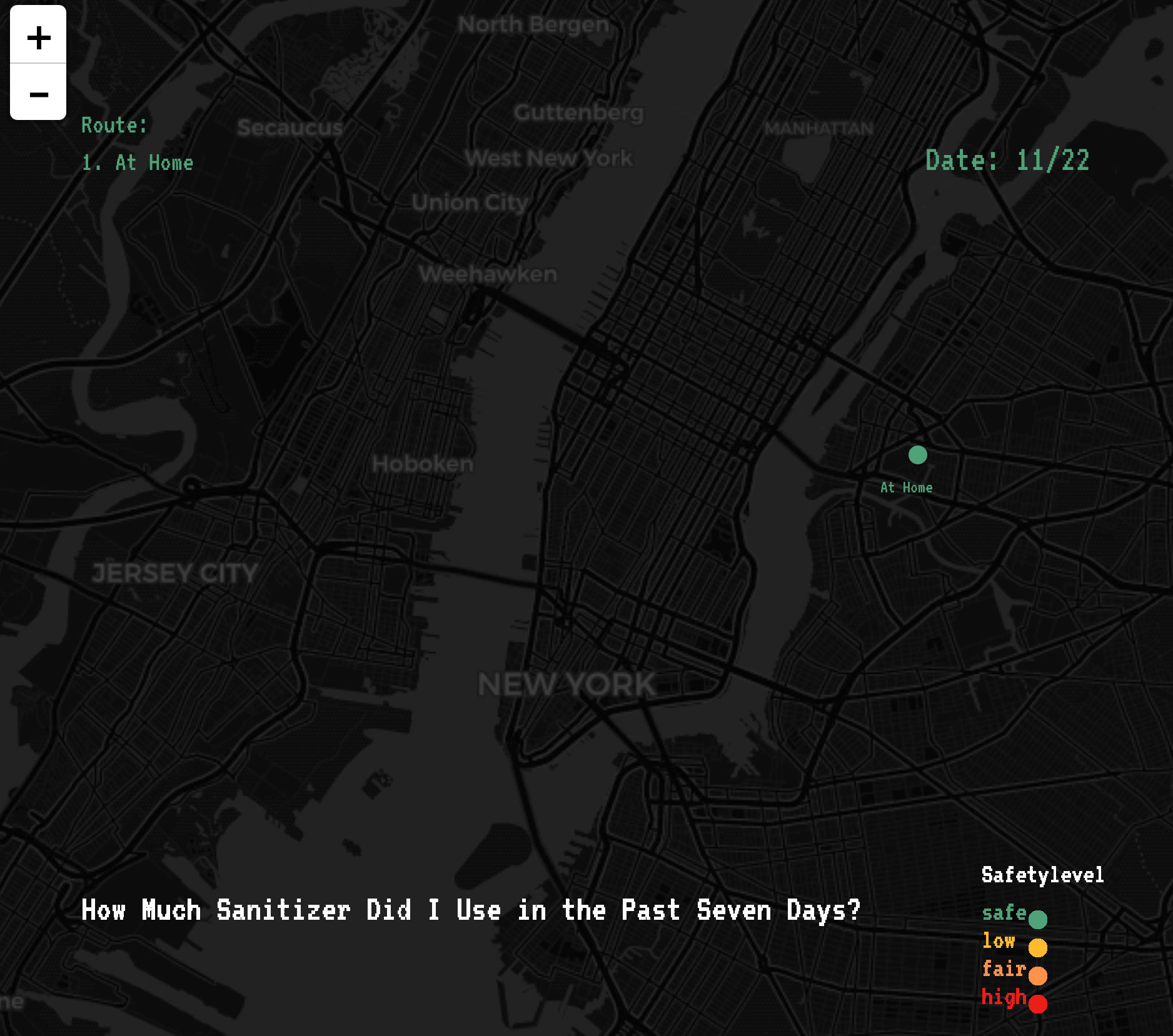
In this dynamitc data visualization sketch, I use different colors
to map the level of danger for different locations that I visited.
For example, green = safe, red = threatened.
Each cicle size reflects how much sanitizer I used at that place.My
route are also shown with connected lines.
This program will calculate the sum of times I used sanitizer are
visualized as the quantities of sanitizer bottles.